So, in the last update I told you about the User-Feedback sessions I am running here at the pirateship workspace.
While user feedback about bugs and crashes is great and running software on different hardware is insanely valuable for the development process, the biggest hurdle I feel I have to overcome is that of a consistent, friendly and non-overwhelming user-interface.
Moviesandbox can do a lot, even in this early stage, but part of the reason it can do so much is that as of right now, I can just quickly add a line of code here and there and bend it to my needs. In a proper release version, you shouldn’t have to look at (or change) code to get the functionality that you want. So a lot of features have to find their way into the program in the form of icons, dialog boxes, menus and so on.
Many books have been written about User Interface (or User Experience) Design and I personally love Bill Buxton’s work.
But reading a book and implementing your very own interfaces are two separate things. The wonderful folks over at Wolfire blogged about it extensively.
Now, I am not as much of a programming whizz-kid as those guys and thus won’t be able to incorporate WebKit into Moviesandbox (although, who knows, maybe some day…). But structuring information in a way that it is easily accessible is one of the things I am most concerned about for the full release.
The current user interface has taken some inspiration from Photoshop, but I did not spend much time to make things scalable, think about colors or personalization or even overlapping areas yet. I also feel that every good interface has some sort of redundancy and multiple ways of doing the same thing – either through menus or through icons – where possible.
I was taking to a friend early on about his preferred mode of navigating 3D space, and it turned out that it’s not based on the WASD navigation method that I am most used to.
So there’s really no reason why MSB should be stuck on that one. An Orbit tool was high on the list of feedback points from the user testing session.
One of the bullet-points that stuck with me was the idea of storytelling as a tool in user-interface design. Now, this can mean many different things, but to me, it means that icons are arranged in a way that you naturally progress through them as you create your movie – having select at the top (so that it’s easy to go back to), then navigate, then grid, then draw (and yes, they are not in order currently), as that seems to be a good flow of things that are needed during asset creation. Then skeleton stuff, and so on.
There’s still much to communicate apart from that. I am doing a very bad job at communicating what the currently selected drawing is, I still don’t think that it’s a good idea for people to type in a name before they draw anything, selection should give you a gizmo with which you should be able to move and rotate things without the right-click menu and so on and so forth.
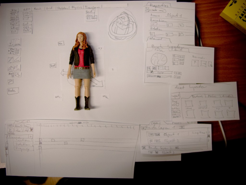
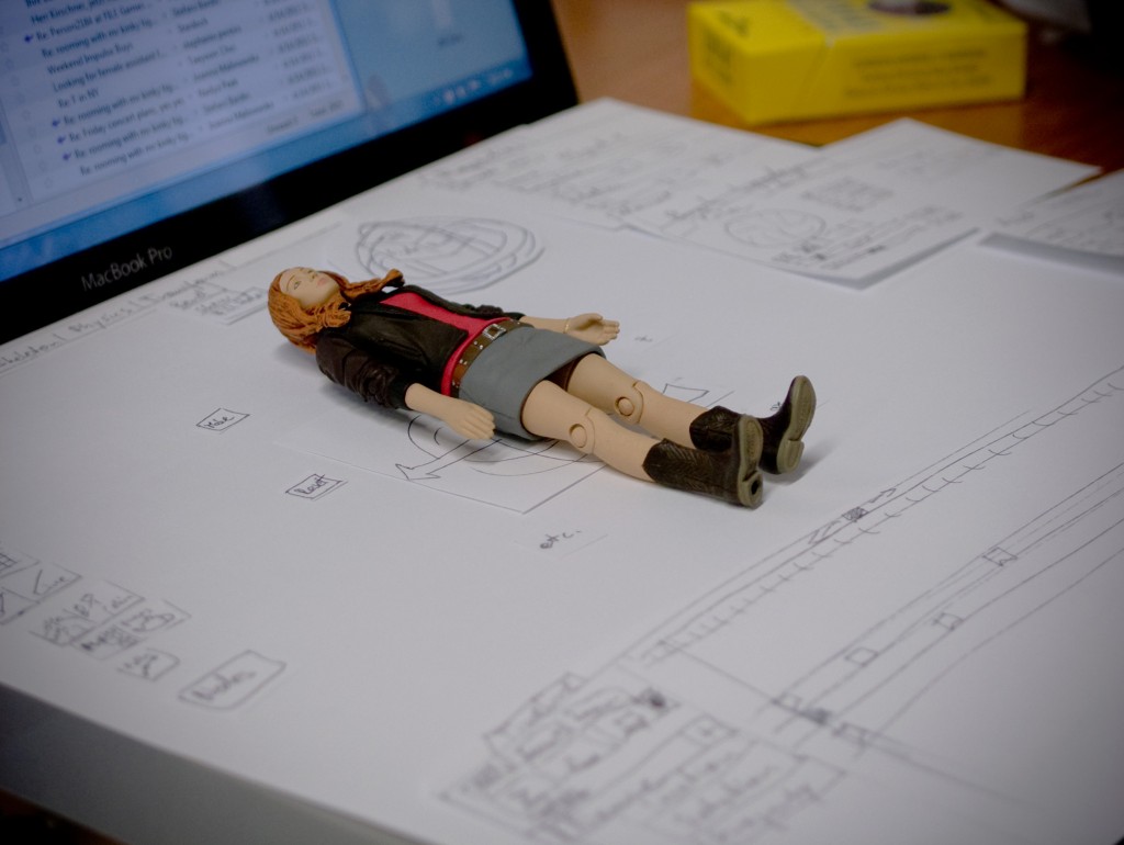
So I am working with pen and paper to try and figure out what needs to go where and how to best structure information. I still want things to look easy and approachable. One of the reasons I got into this whole mess is that I was scared to death by 3DStudio’s or Blender’s user interface…
